
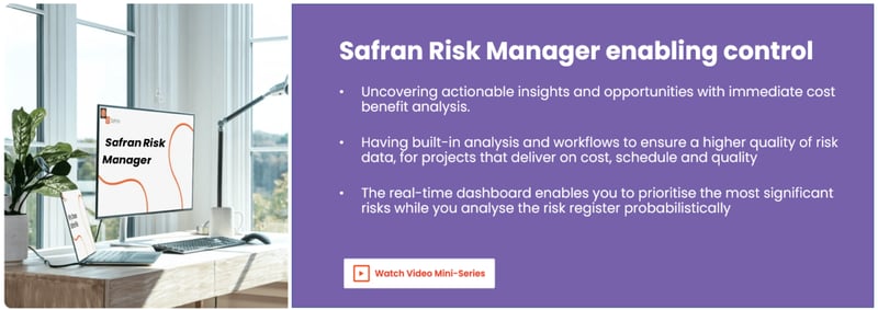
How Can Safran Risk Manager Enable Project Management Actionable Insights?
The Value-Added Risk Register
Gathering really good project risk data from subject matter experts is the foundation of building a high-quality project risk register. But once the initial risk identification step is complete, how much value is there in the data that has been gathered?
Spreadsheet risk registers tend to focus on the risk-by-risk data, helping the project risk team to prioritise risks by score or factored value. But with just a bit more data, it’s easy to gain deeper insights into both individual project data as well as programme or project portfolio data, to answer more value-added questions such as:
- Where can I get the most benefit from my limited resources?
- How well is my risk management process performing?
- How is my programme or portfolio performing?
These and other similarly structured questions can help everyone in a project organisation derive so much more value from their risk data. But how does a project begin to answer these questions?
Consistent Project Risk Categorisation
The number one secret to getting good quality information from data is consistent categorization. The easiest way to achieve this in a spreadsheet is to use a data validation list, which ensures that only consistent values are created within the cell on the spreadsheet. This prevents the most common errors such as misspelling or acronyms from causing the categories to become muddled. However, maintaining data validation lists within a spreadsheet can create problems, and there is no certainty that different projects will use the same data lists. Whilst not a problem on individual projects, this does prevent risk data analysis at programme or portfolio of projects level.
Deciding on which categories to use is another bone of contention. The person entering the data wants an easy life, and as little work as possible. However, the person analysing the data would like as many data points as possible, in order to cut and dice data as they see fit. So a compromise is often found, with a minimum set of categories being agreed upon. Ideally all the agreed categories will be completed for each risk.
Unfortunately, spreadsheets rarely contain mandated entry fields. As such, it is easy for the data entry person to skip a category field, in which case the risk data point will be excluded from the category analysis.
Database risk tools can overcome these shortcomings by creating mandatory data entry fields and universal data validation lists. In addition, more sophisticated databases can also include personalised category defaults to shortcut the data entry process. In this way, consistent categorisation can rapidly become a normal part of the risk creation process whilst at the same time generating the added value data that the analyst seeks.
Risk Register Graphical Visualisation Benefits
The second secret in discerning high-quality information from data is visualisation. The phrase “A picture paints a thousand words” has never been more true than in the age of computer data.
While it’s true that spreadsheets have something to offer in visualising the risks in the risk register, not everyone has the time or the technical capability to create charts that enable comprehensive insights into the risk data. And, as we have already discussed, some critical data may be missing.
So what sort of data should we be visualising? In simple terms, we should be looking at a combination of qualitative data (referring to subjective measurements, such as good or bad, high or low), and quantitative data (referring to numeric values or counts). Each data type has its benefits when used appropriately, however favouring one data type over another can introduce bias into the decision-making process.
A good example of the value of qualitative data is analysing the risks that have been closed. A closed risk on a spreadsheet is usually ignored as having no further value. However, if it can be determined why the risk was closed, then this can provide insight into how well the risk management process is performing. For example, by creating and mandating a category type for ‘Risk Conclusion’ all of the risks will need to be categorised when they are set to closed. These categories might include: risk occurred, risk did not occur (untreated), risk did not occur (treated).
Figure 1 demonstrates how such data now paints a vivid picture of a project that is only successfully treating a quarter of its risks, while the rest are either occurring or closed because something else happened.
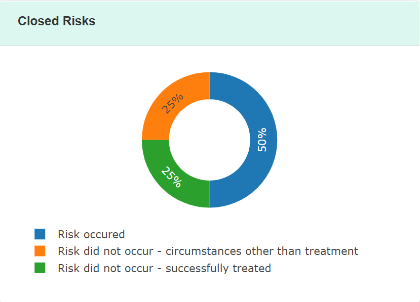
Figure 1 – Risk Conclusion Data
If your team struggles to benefit from project performance results data, why not use the risk data to help illustrate and identify areas for improvements by offering a richer ‘pick-list’, for example:
- Risk Occurred – Low priority (decided no additional treatment offered)
- Risk Occurred – Despite treatment in place
- Risk Occurred – Before treatment could be Implemented
- Did Not Occur - Successfully treated
- Did Not Occur - Circumstances other than treatment
When considering what quantitative data to analyse, the simple cost and time impact for each risk are often used, as these are the most basic quantitative units. However, if you are able to look just one layer deeper into the data, then a whole new area of added value is opened up to you.
For example, capturing the cost of an anticipated action should be a standard piece of data that the action owner should consider when estimating the treatment for a risk. After all, without knowing what treatment is likely to cost, how can the action owner know if they can afford to implement it?
With this one piece of additional data, and knowing the pre-treatment and post-treatment estimation of the impact, we can now ask a really insightful question: Which of my risks derives the most benefit from taking action?
A simple formula can now be used to derive a benefit ratio, and a simple chart (figure 2) now clearly indicates which risks get the biggest bang for their buck!
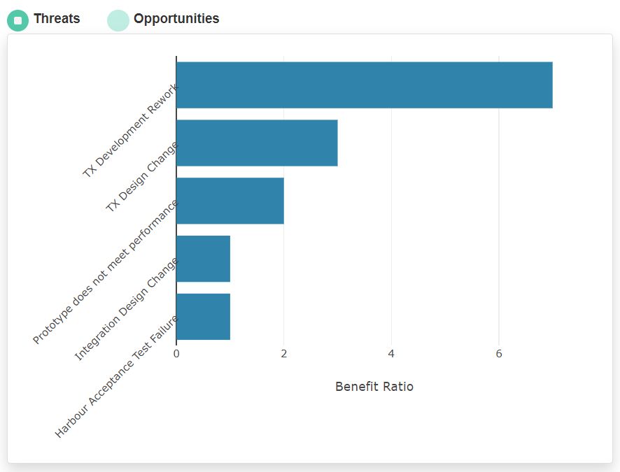
Figure 2 – Cost Benefit Ratio
The beauty of a dashboard is that it can consistently present the same data for a project month on month. However, when this is held in a spreadsheet, it will usually only show the data pertaining to a single project. When projects form part of a programme of work, or are members of a portfolio, it is not so easy to aggregate such spreadsheets into a single view. With a database approach, adopting consistent categories and standard visualisation, it is much easier to use the same dashboard to look at the data from multiple projects. In doing so, it is possible to quickly see the bigger picture. For Directors of Risk, it is possible to gain insight into how effectively all of the projects are closing their risks. For Programme Directors, it is possible to see which risk across the programme gains the most benefit from the investment of limited resources.
Risk Register Actionable Insights
Being able to dive deeper into your valuable project risk data can yield many surprising results if you know how to ask the right questions. Fortunately, anyone who uses Safran Risk Manager will have considered these questions already. The dashboard has been specifically designed to provide critical insights to answer the following questions:
- How many threats, opportunities and issues does my project or portfolio have? In which risk lifecycle are they? Are they of high or low importance?
- How many closed risks have been successfully treated?
- What are my most important threats or opportunities? How are the different impact types assessed? How does this project’s risks compare against the programme or enterprise scoring method? What does my programme or portfolio of risk look like?
- How much financial impact does the risk register indicate comes from risks? How does pre-treatment compare to post-treatment? How much confidence would different amounts of contingency give me?
- What are the cost-benefit ratios for my threats and my opportunities? How much money are we spending on actions? How much benefit does the project or programme derive from the identified actions spend?
- Which category of Function, Risk Breakdown Structure or Owner has the most or fewest number of risks? Which category has the largest maximum financial impact value before or after treatment?
- What are the proportion of cost to time to qualitative impacts? How do these break down across the project?
Managing a Spreadsheet Risk Register vs Safran Risk Manager
To summarise, it is possible to gain some insights into your risk register using spreadsheets if your risk team has the time and the capability to ask the right questions. It is then necessary to ensure the project team adopts strict behaviours when creating and maintaining the data. By introducing simple to use software like Safran Risk Manager, projects can effortlessly ask the right questions, play with pre-made widgets to see the bigger picture, or drill-down into the detail, streamline the data gathering and update process, and begin to engage in more value-added dialogue.
Does your team suffer from poor visibility of project actionable risks, and reduced insight into the impacts and opportunities posed by closed project risks? Safran Risk Manager is specifically designed to help you leverage qualitative and quantitative data to save time, drive better risk management practice, and increase the performance of your team. Showing you more of what really matters. Get in touch with one of the Safran experts today and request a free trial of Safran Risk Manager.