
Gantt chart is a bar chart that shows the relationship between the start and end dates for the tasks that make up a project. Commonly used by project managers for planning and scheduling, Gantt charts are useful because they provide a bird’s eye view for tracking deadlines and dependencies and ensuring that resources are properly allocated.
They can also be used as a diagnostic tool to assess the progress of a project timeline, correctively distribute resources for certain activities, and communicate with management and project stakeholders.
THE GANTT CHART
The Gantt chart is back in fashion again. It’s being rediscovered by project managers who admire its usefulness.
We’ve assembled a short history of the Gantt chart or bar chart. We will look at its origins, uses, and provide a summary of the possibilities in project management and planning of this simple, yet powerful visualization tool.
In this first of four blogs, we will focus on the history of the Gantt chart – what is it, who invented it, and what purposes does it serve?
Using pencil and paper was once the only way to create Gantt Charts. To some extent we still do this when we sketch out an idea, either on paper or on wall charts.
Some planners may remember using Letraline tape to draw the bars. You could find Letraline and an X-acto knife as well as pencil and paper in nearly every planner’s desk in the 1970s and early 80s. The drawback was that you had to redraw the chart manually every time a project changed.
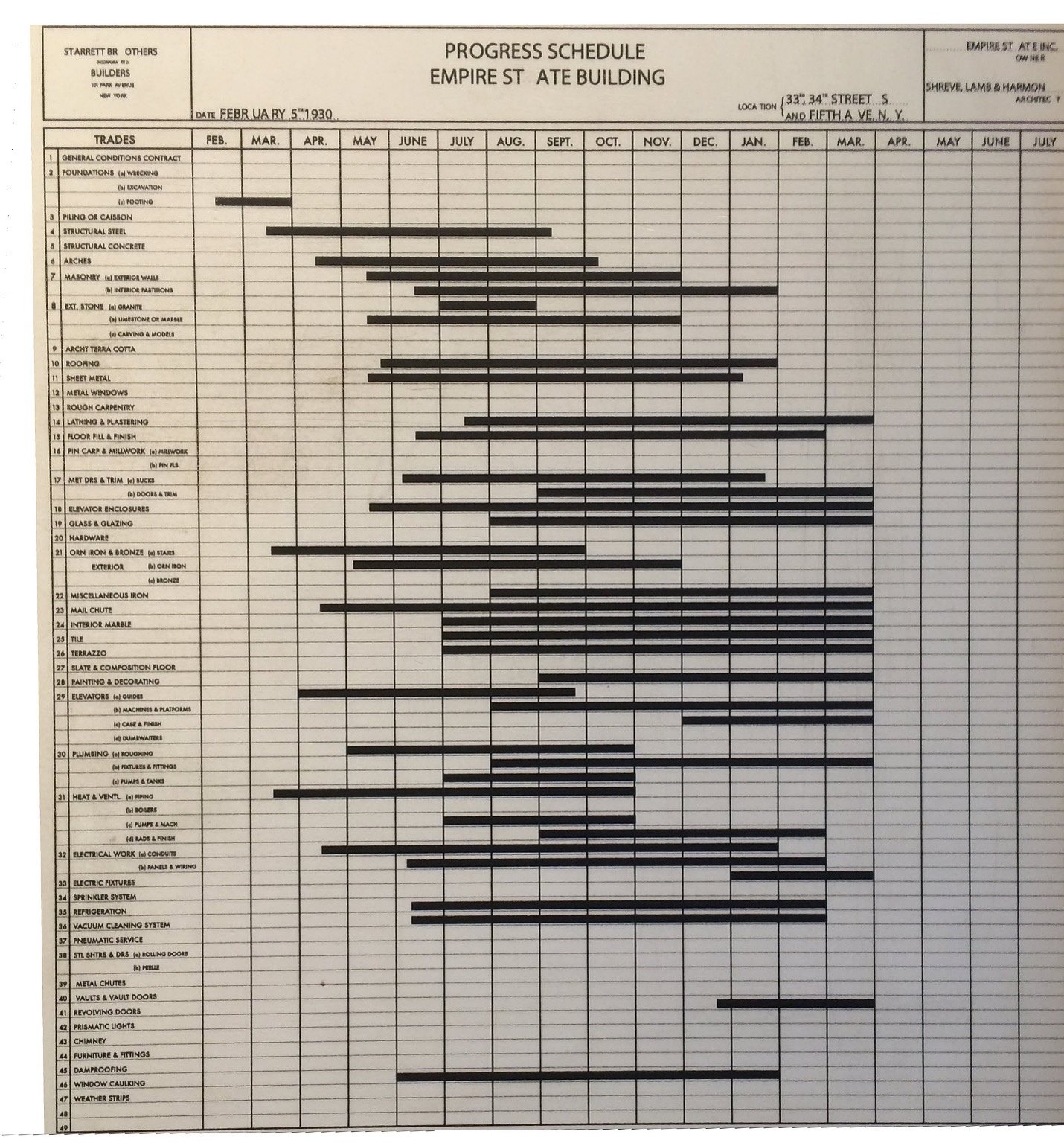
Gantt charts are commonly used in Project Management and production scheduling and are probably the most popular and useful way of showing activities displayed against time. Each activity is represented by a bar. The bar’s position and length represent the activity’s duration, start, and end dates. The Gantt chart has a calendar legend across the top of the chart. To the left you’ll typically find a list of activities (tasks or events) with information like description, dates, and the employees responsible.
Even with modern project management software it is still common to receive simple schedules created in Excel or PowerPoint. Great as they may look, they are hard to update. In fact, they rarely get updated.
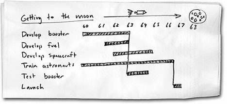
A simple Gantt chart may look like this, the schedule that took us to the moon.
HISTORY OF THE GANTT CHART
Charting to visualize schedules has a long history within the management disciplines. In the mid 1890s Polish engineer Karel Adamiecki (1866 – 1933) introduced the Harmonogram. Adamiecki was interested in management techniques. His Harmonogram tool was part of a wider philosophy, which included practical scheduling, the importance of creating harmonious teams, and compatible, measurable means of production. He claimed that companies implementing his methods and philosophy gained productivity increases of up to 400%.

On the left-hand side, the Harmonogram has a date scale on the vertical axis. Activities are listed across the top. A paper strip represents the start and finish of the activities. The name and duration for each activity together with lists of predecessors and successors is listed across the top of the chart. The strips representing the preceding activity are always to the left of the strip of the successor. Working your way across the chart from left to right, the mechanics of the process is similar to the calculations of the forward pass in Critical Path Management (CPM), a system developed some 60 years later.
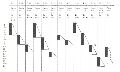
The Harmonogram was a workflow network diagram that provided a visualization of production problems. The technique was presented to the Society of Russian Engineers in 1903 but was not published until 1931. It was written in Polish, which is likely the reason why Adamiecki’s work was not well known or widely distributed.
During 1912-1914 Swiss engineer Herman Schürch (1881 – 1957) was responsible for building the Langwiews railway viaduct in Switzerland. To manage this project, he introduced a graphical and quantitative chart named “bauprogramm” – building program. Each work week was assumed to be 5 days of full work. Together with the bar chart he introduced supporting histograms that showed the total demand of construction materials and the overall effort. It is also interesting to note that the bar chart used shading effects to represent different types of work, and the chart was grouped by each section of the viaduct.
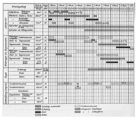
“Für the Durcfürung der Arebeiten wurde ein ganz genaues graphisches Bauprogram aufgestelt” (A very precise construction program was set up for the execution of the work.)
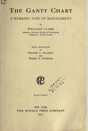
Most likely, Henry L. Gantt never used the term Gantt charts himself. In 1922, three years after Gantt’s death, Wallace Clark published “The Gantt Chart – A Working Tool of Management.” The book was developed from a series of articles on “the Gantt Chart” for Management Engineering.
Henry Gantt (1861-1919) was a mechanical engineer with a detailed interest in management issues. Amongst others he worked closely with Fredric Taylor on scientific Management. There are two main components in Gantt’s work. One is the move away from scientific management and strict control of the workforce to an approach where productivity increases would be based on learning and motivation. The second component was the use of numerous charts that visually display data to highlight production issues and problems. His version of the bar chart was introduced in 1910. It focused on planning the production sequence for batches of work in a machine shop.
The Gantt chart is one of the most enduring charts in management. It’s hard to envision modern project management without a chart that visualizes deliverables along a timeline or calendar-line.
BENEFITS OF THE GANTT CHART
Gantt charts create simplicity and value in project and production management. As a result, they are widely accepted and utilized. Everybody understands the Gantt chart. They are straightforward, simple, and intuitive.
Gantt charts provide a clear overview of:
- The list of tasks (activities) required to complete the work
- The tasks’ relationship between one another
- The beginning and ending of each activity
- The duration of each activity
- Where activities overlap with other activities, and by how much
- The duration of the whole project
- How one task builds on another within a project
- Progress compared to the schedule- (What progress is being made in the execution of a plan or program; are we ahead or falling behind?)
The Gantt chart add value to any management discipline concerned with time. Its intuitiveness is striking — its clarity makes it considerably easier to communicate about the project with employees and management by providing the information management is seeking. It is a great tool for reporting and visualizing progress and can easily be used in status reports and status meetings to show how much of the planned work has been completed. Gantt charts can make a difference in project transparency and project knowledge.
Safran Planner and Safran Project utilize Gantt charts in their main user interface. Functions like customizing columns, symbols, timelines, and filters, as well as grouping and sorting bring the Gantt chart alive and are easily done. In the following blogs we will look closer at how to create a Gantt chart and how to get the most value out of it.
If they were alive today, Karel Adamiecki, Herman Schürch, and Henry Gantt would probably be astonished to see that the charts and methods and techniques they introduced continue to help managers bring their projects under control and assist in good communications.
.png?width=1200&name=Safran%20-%20Blog%201%20Graphic%20(1200%20x%20300).png)
