
Collaboration and clear communication are major objectives of project management. When it comes to keeping everyone on the same page, Gantt charts are among the most used tools for Project Managers. Because Gantt charts are easy to read and easy to understand, they are an essential tool for visualizing the necessary steps to deliver a successful project.
As discussed in a previous blog "How to Create an Effective Gantt Chart | A Project Manager’s Guide", the simplest Gantt chart consists of a task list combined with a graphical display of bars against a timeline.
Gantt charts should meet the requirements of modern scheduling and project management. That is, they should be able to show relevant information about all activities or phases of a project. Planning and scheduling applications like Safran Planner and Safran Project provide many features that allow you to enhance and enrich your Gantt chart.
To give you some ideas of how you can enhance your Gantt chart and make it more valuable we have put together a helpful checklist. Here are a dozen ideas for you to enhance your Gantt charts and make them more effective tools to aid successful project delivery.
1. Define Your Columns and the Information You Want to Display
Typically, you will find information such as Activity ID, Description, and Start and End Date of the activity in the columns or task list section of a Gantt chart. If the purpose of your Gantt is to show progress according to plan, you will add columns like Planned Percent Complete and Actual Percent Complete. Many also like to add resource requirement and responsibility to this section.
The information you choose to display should support the purpose of your Gantt chart, while any unnecessary information should be removed.
2. Set Your Timeline Resolution
The timeline of the Gantt chart can be set with various resolutions (hours, days, weeks, months, quarters, years etc.). This is often defined by the length or span of your project, or by the project type. For example, a short Turnaround Project lasting a few days and with activity durations down to minutes or hours will need a more detailed timeline than a 3-year construction project.
If you are going to highlight certain areas of the schedule, you may also want to create a more detailed timeline for those areas than the one used for the project overview.
3. Define Your Bars
The basic Gantt displays the activities with a bar showing the start and finish dates of the activity. You can add more bars to your Gantt for comparison reasons. It is a principle within project management to set a baseline at the start of the project and before work starts. As work progresses, comparing the updated schedule with the baseline bar lets you easily see how you are progressing according to your plan and to identify where you are ahead of schedule and where you are falling behind.
The ability to add multiple bars to your Gantt is a must in modern project management and modern Gantt charts.
You may also consider adding bars showing:
- The original schedule
- The current baseline
- Actual progress
- The rescheduled dates
- Forecast dates, and more.

4. Apply Colors to Enhance the Power of Visualization
Colors are great when it comes to enhancing the Gantt and making it easy to understand at a glance. Use different colors for your bars to identify different dates, or add conditional colors based on progress, project phase, responsibility, resources, and more. Showing critical activities in red is a typical highlight of Gantt charts.
In Safran Planner and Safran Project conditional color formatting may be added to bars in the Gantt chart and to the columns in the task list to highlight information on progress, KPIs and more. Filters and formulas can be used to make activities light up when a certain status changes or a value is overrun.
Using colors on your Gantt chart is a great way to standardize information in your organization and make your Gantt more attractive, eye-catching, and easier to read.
5. Add Milestones for Major Deliverables
Milestones representing major deliverables, events, or decision gates should be added to the Gantt using different shaped symbols and colors. This keeps your focus on achieving milestone dates that may define go or no-go for your project.
6. Show Dependencies and Logic Between Activities
Your Gantt chart is very useful for combining the timeline display with the dependencies between activities to show the planned flow of work. (In the past, Gantt Charts have been criticized for being unable to show the interdependencies of activities and thus giving limited predictive value.
In fact, this was one of the early limitations discussed by Henry Gantt himself. But the ability to draw charts that show these links has been around for a long time now. Even so, some recent textbooks still claim that this is a major limitation to the Gantt.) On larger projects with thousands of activities the dependencies may clutter your Gantt, so the ideal control is the ability to easily turn dependencies on and off.
7. Track Non-Work Periods in Your Project Calendars
You may add shading for time periods where no work can be planned or take place due to holidays and non- work periods. Work that is planned to take place during a non-working period should prompt a few warning bells.
8. Add Grid lines and Shading to Spotlight Key Dates
Grid lines and shading are useful for highlighting specific dates and time periods. Perhaps you want to mark the due date for start prefabrication across the schedule, or you want to shade time periods of shut-down, drill-stop, lifting campaigns etc.
You can use Swimlanes to clearly indicate how the Gantt chart is organized and sectioned.
9. Show Progress to Date, Date Line and Frontline
As your project starts to progress, you can add progress information to your Gantt chart in various ways; add planned and actual progress columns to the task list, add shading to the bars to show progress, add an extra progress bar to show actual start and actual finish dates. In addition, the status date and front-line date can help you to clearly show where you are ahead of schedule and where you are falling behind. If the frontline date turns to the left you are falling behind, if it turns to the right, you are ahead of schedule. It is as simple as that.
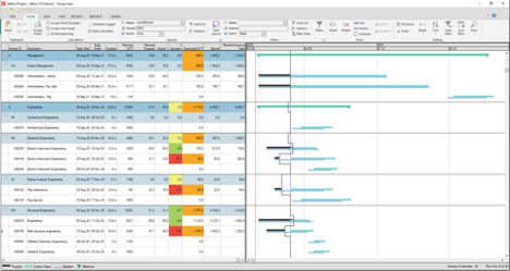
Gantt Chart Section with Swimlanes, Conditional Formatting, & Front Line to Reveal Which Tasks are Ahead of or Behind Schedule (Safran)
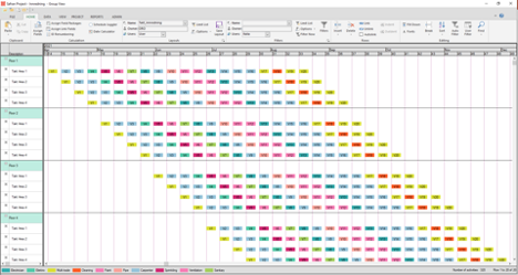
10. Sort, Group, Organize, and Reorganize your Schedule
In larger schedules the capability to group, organize, and sort your schedule is invaluable. Large schedules with a high number of activities can be hard to read if they aren’t organized and grouped. Typical data for grouping is discipline, work package, project phases, modules, blocks, floor, responsibility, and other project attributes. Organizing your data turns it into meaningful information. If data is not organized, it’s not actionable.
Applications like Safran Project and Safran Planner make it easy to organize and re-organize your Gantt chart to serve different purposes and to give different views and insights into your schedule.
11. Summarize Your Schedule
A summary view is great for visualizing the overall picture. Detailed views serve a purpose when drilling down to the lowest level of activities and resources and when the dependencies between activities and their individual progress need to be understood. However, your summary Gantt should be based on the data from the lowest level, and should not be created as a stand-alone Gantt chart disconnected from its source.
When your project manager asks for a summary Gantt, make sure it is based on the true schedule, and not just a drawing in PowerPoint.
12. Sort and Focus Important Activities
To interrogate and analyze the schedule, you need to focus on a subset of your activities. The information is in the schedule but is not helpful if it is scattered around on several pages or is hidden on page 27 of 63 page report.
You will probably be asked to provide a report that shows the activities that belong to a specific department or employee, activities leading into a delivery milestone, late started activities, critical activities, low performance, delayed activities, out of sequence activities and more. To do so, you need a Gantt tool with excellent filtering capabilities.
“I just want a Bar Chart”
The Gantt chart has proven itself for more than 100 years. The Gantt charts of today should be part of planning and scheduling software so that they can meet the demands of modern project management. Modern Gantt charts are more than just a drawing tool. Your software should deliver Gantt charts that show all relevant information about specific activities or phases of a project. They should have powerful formatting features that allow you to make informative, eye-catching, and engaging graphs.
The Next time your PM says, “I just want a bar chart,” ask what is the purpose, who is the audience, and what should it look like? The bar chart or Gantt chart can be incredibly useful because it allows you to highlight the right part of the information and makes it straightforward to provide critical information about complex projects. Create your next Gantt chart with the intention of keeping everyone on the same page, informed, updated, and engaged.
Safran Planner and Safran Project come equipped with tools that allow you to easily customize and enhance your Gantt charts so that you can provide your organization with current and relevant status information. Using Safran software you can integrate any or all of the above suggestions to adjust and customize your chart layouts. That means it’s easy to provide project status updates from a bird’s eye view or by drilling down to focus areas or specific sections.
In this blog we have discussed several ways to enhance the Gantt and the information provided to project managers and stakeholders.
In our final blog in this series about the Gantt we will introduce duration uncertainty and discuss how the information from a Monte Carlo simulation can be added to the Gantt chart to enhance the understanding and effect of duration uncertainty and delivery dates.
When the input is a range of durations, the output is a range of possible dates.
.png?width=400&name=Safran%20Blog%20Series%20-%20Blog%203%20Graphic%20(Previous).png)
.png?width=400&height=200&name=Safran%20Blog%20Series%20-%20Blog%203%20Graphic%20(next).png)
