Conveying complex risk data to stakeholders and the C-suite – and making the data compelling – is often a challenge for project managers. Thankfully, Safran Risk has tools to help achieve this.
In this post we’ll explore one of the more advanced features of Safran’s software suite – the risk-impacted Gantt chart.
The Challenge of Risk in Complex Projects
In smaller and less complex projects, risks are fewer and more obvious. On these sites, a project manager can survey the situation around them and see all the work and potential things that might go wrong. However, on larger, more complex programs, risks and opportunities are less self-evident. In fact, the only thing that’s self-evident across all projects is that they all experience issues. Many of the risks will be caused by the confluence of non-technical risks (supply chain issues, program management, change management, stakeholder engagement, etc.) both inside and outside the program.
In a simple project, such as the lengthening of a railway platform in a more rural area, the PM can see all the physical and back-office work being done that affects the project. In a large and complex programme this is much more difficult. There are strategic issues, stakeholder issues, and feedback from the team that will change the way the PM delivers from month to month.
From a risk perspective, in a standard project, the PM need only ask the Risk Manager what the next month's contingency is in order to get a good idea of just how much wriggle-room they have for mistakes. But in a megaproject, risks are compounded by work in supporting and parallel projects. The PM will be unaware of the increase in certain risks – particularly non-technical risks – due to the changes in causal factors far upstream.
When an S-Curve is Not Enough
In a standard project, therefore, an S-curve output for the PM will be more than ample. They only really need to confirm their suspicions about whether things are better or worse, and by how much.
In a complex megaproject, however, the overall contingency is affected by a wide range of non-technical, confluent factors. All together, these elements can produce a scary risk number. Scary outputs from risk simulations are usually met with disbelief, especially when the audience is the senior management, executive team, or the Board. Boiling down a subtle set of upstream factors for these people is as daunting as it is challenging. For this audience, then, the standard S-curve or heatmap simply will not be sufficient. These people need to be able to consume and digest a series of logical antecedent causal factors which, if true, will blow the bank. And it needs to be done in a visually engaging way.

Making Complexity Compelling
You need to get across the complexity of the risk to show senior management that your schedule calculations are correct. The question is, how can you engage senior management with what is often a series of dry, causal factors in a visually stimulating way?
One solution is to provide a risk-impacted Gantt chart like the one below:
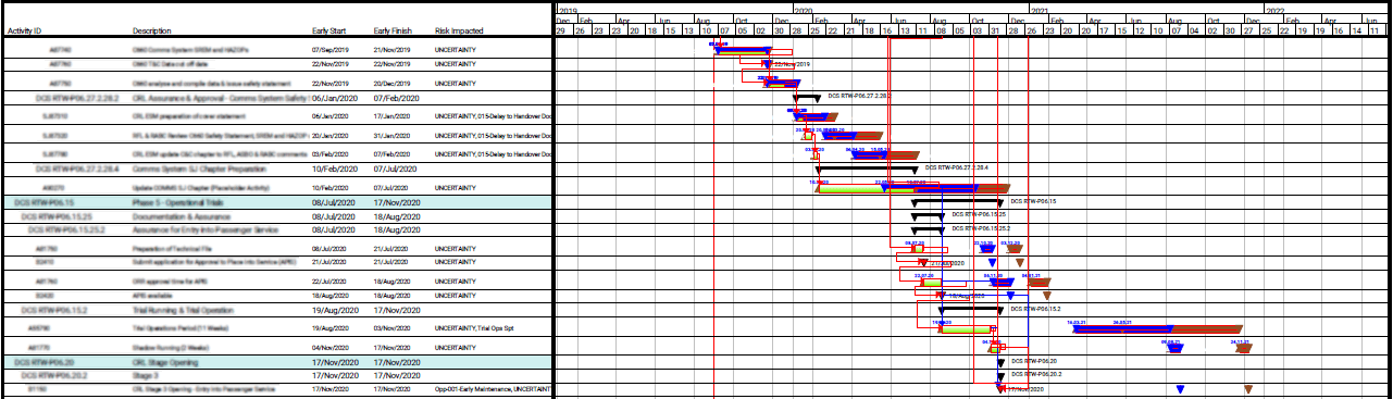
This chart shows the results of risks after a schedule simulation, namely:
- The deterministic task dates (GREEN)
- The P50 task dates (BLUE)
- The P80 task dates (BROWN)
It clearly depicts which tasks have been impacted by risks and, in the fifth column of text, exactly what risks these were. The logic links also enable you to see whether the lateness of one task will mean the lateness of another. By tracing logic upstream, you’re able to see all the subtle and complex reasons why a relatively minor technical dispute/variation can seemingly have a disproportionate effect on the schedule.
But why do you need to highlight all these subtle reasons?
Senior management will understand the effect on prolongation that a technical risk might cause. However, they probably won’t understand the potential, total length of the prolongation when all risks are viewed together: When governance and supply chain engagement is factored in; when supply chain engagement is factored in; when engineering change management is factored in, etc. All these small risks may have a disproportionate effect on the total outturn date.
In this case the prolongation really is the sum of all the parts. However, in a separate blog post we’ll go through why the financial risk of complex prolongation often isn’t merely the cost of prolongation.
Creating Risk-Impacted Gantt Charts
Safran makes it easy to generate visually engaging risk-impacted Gantt charts. Moreover, once you’ve created these views you can apply them quickly and easily in any project.
- Create a Filter
The first part of the process is to create a filter and make sure you’re only looking at the critical path (CP). In a large, complex programme this will ensure that we’re only looking at the most important parts of the schedule.
Simply right-click on the schedule and you’ll be able to highlight links on the CP (as shown in the image below). This isolates the CP, but now we need to add other factors, like whether a task is impacted by risk or not.
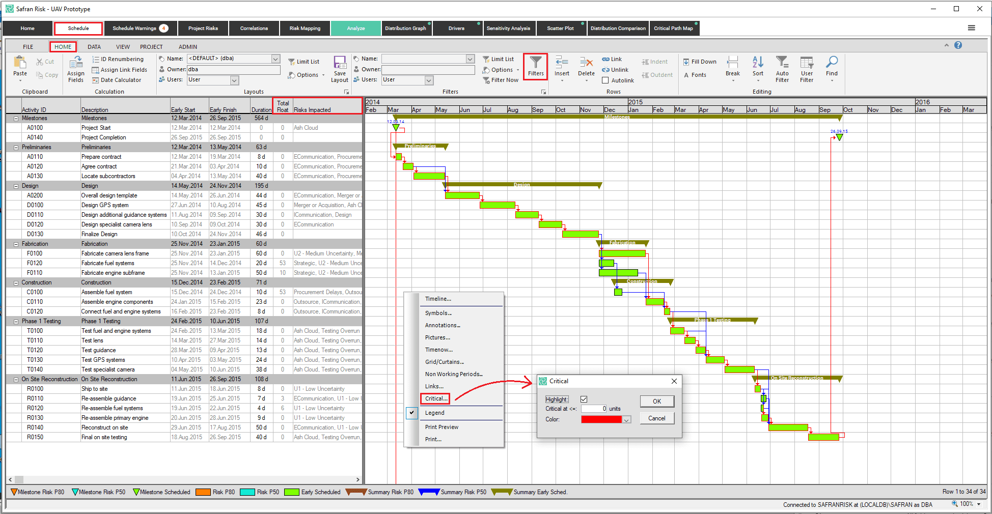
- Isolate additional factors
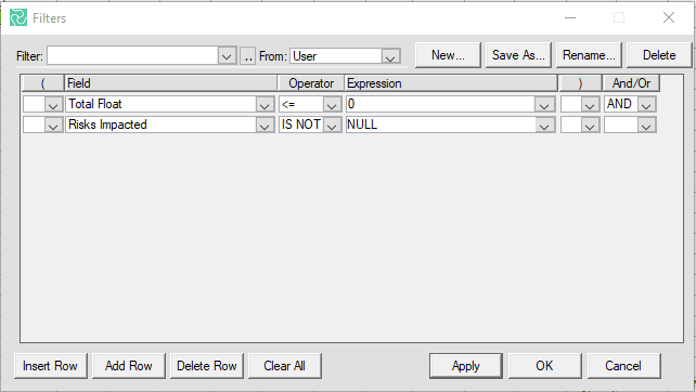
To isolate additional factors, like the impact of risks, navigate to SCHEDULE > HOME > FILTER and click on the FILTER button. This will pull up the menu below and allows more fine-grain choices and simplifies the schedule view.
In our example, we choose the CP by specifying ‘Total Float’ of 0. However, we could easily choose negative float or even limited float (as shown below).
We’ve also chosen only to see those CP activities which are impacted by risk. In the real world example at the top, our risk register also specified UNCERTAINTY, so the CP contained many more risks. If, for some reason, you want to remove mere UNCERTAINTY from the CP view, you can add another criteria to remove ‘Risks Impacted’ which are not uncertainty.
Once you’ve created your filter you can then save the filter and apply it anytime in any project.
- Color code for clarity
At this point you need to highlight, for any given task, the deterministic dates, the P50 dates, and the P80 dates (if those are the confidence intervals you’ve chosen). Colour coding is essential to differentiate the different outcomes of the same tasks.
To make the impact of risk more obvious, you can change the color and view of the various symbols. To do this, simply right-click on the Gantt chart and select SYMBOL from the drop-down menu and you will be presented with the following table:
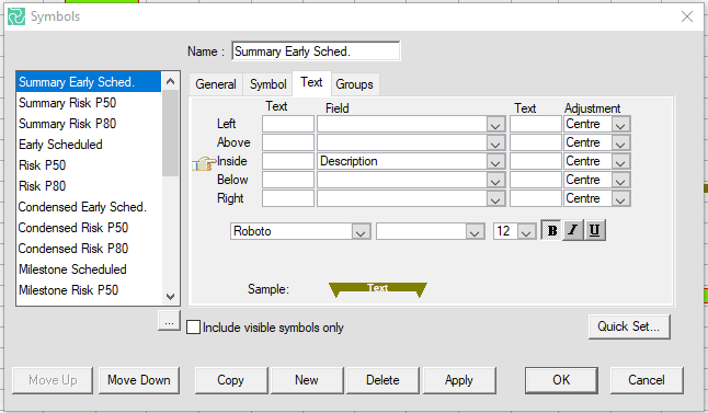
In this example, we've developed a number of different symbols to differentiate, particularly, P50/P80 activities and milestones from their deterministic parents.
Use the SYMBOL and TEXT fields, as shown above, to change the appearance of your activities. Choose colors and nomenclature that are relevant and meaningful to the senior management so your Gantt will have the same look and feel to the PPT slides they’ve already seen.
The Benefits of Using Gantt Charts
In most cases, senior management will be exposed to Gantt charts which highlight the amount of prolongation to the programme due to the direct impact of technical risks. These are usually simple but effective PPT slides which clearly set out the core problem in a way in which all areas of the executive can easily understand. In large and complex programmes, however, the technical issues are usually just the beginning of the problem.
The primary benefit to the way we’ve set up the risk-impacted Gantt is that you’re not only able to get across the full and exact impact risk, but you’re also able to convey the complexity of the logic.
Complexity can lead to scary outcomes, but with views like the risk-impacted Gantt chart Safran have made it much easier to visualize and tackle the risks. Developing a risk-impacted Gantt can take a few minutes to configure, but once it’s done it’ll save you time and create a lasting impact from your simulations.
