Information is key to project control and management. Without the ability to communicate relevant and timely information to key stakeholders there is no control over the project and, ultimately, it will fail. To achieve project success, it's imperative to acquire and share information effectively, and the best way to do this is using reports.
Reports are created throughout the project lifecycle, and, while many view them as time-consuming, laborious, and painful, they are one of

5 Project Planning Reports That Deliver Value
- Gantt Chart
- Bull's-Eye Chart
- Progress Summary Report
- Histogram
- Manpower Histogram
In project planning and scheduling, there is a vast amount of data, but data alone can't bring true value. To be useful, data must be presented in meaningful reports. In project management, reports can be used to:
- Show what's planned
- Assist the planner/scheduler in creating a schedule
- Show project progress and status
- Improve forecasting
The examples here are all created quickly and easily in Safran Project using its powerful built-in report generator engine. In Safran Project, reports can be generated one by one or run in batches as a reports package.
1. Gantt Chart (Schedule Bar chart)
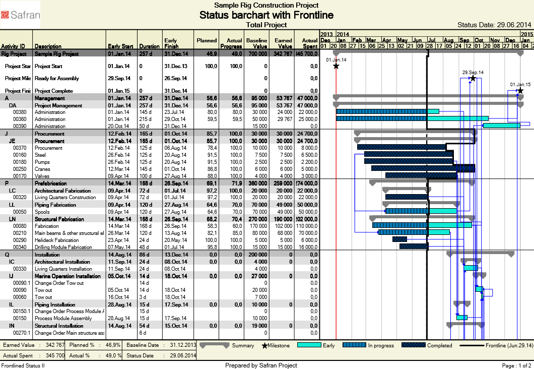
The Gantt Chart or Schedule Bar chart is an illustrative way to display a project schedule. Gantt charts illustrate the start and finish date of all project activities and provide a summary of all project elements. These activities and summaries often comprise the work breakdown structure (WBS). Modern Gantt charts usually contain dependency relationships between activities, as well as additional information like project status.
This particular example shows a variant where the Frontline is introduced. The Frontline indicates whether an activity is ahead, behind, or on schedule (as planned) and provides project stakeholders and management with a good understanding of project status, down to individual activity level.
In Safran Project, you can add an almost unlimited amount of information, both in the tabular area and in the Gantt Chart itself. This example includes, among others, information about the Baseline Value, Earned Value and Actual Spent Value in the tabular area.
Bull's-Eye Chart
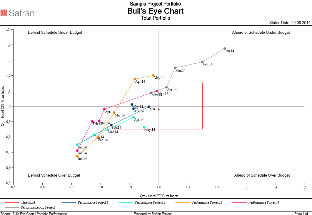
Senior management and stakeholders are often too busy to read reports. A Bull's-Eye Chart is the perfect report to show a quick overview of your project or project portfolio.
The Bull's-Eye Chart shows both the Schedule Performance Index1 (SPI) and Cost Performance Index2 (CPI) and the trend of these indexes. Shown in the report above, for example, are the SPI and CPI for each project in the portfolio, for each monthly cut-off. Including multiple months provides the trend throughout the project lifecycle, and each color is used to represent an individual project for enhanced readability.
In this example, we've included a threshold at +/- 15 % confidence limit, as any "hits" within the bull's-eye don't require any immediate mitigations – hence the name of the report.
[1] SPI = | SPI > 1 = Ahead of Schedule | SPI < 1 = Behind Schedule |
[2] CPI = | CPI > 1 = Under Budget | CPI < 1 = Over Budget |
Progress Summary Report
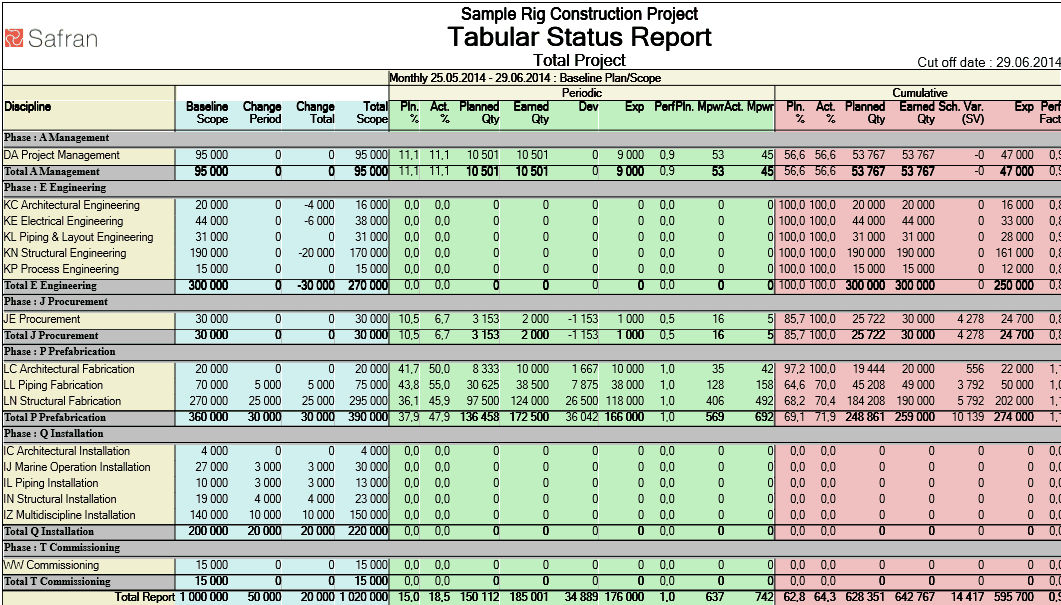
Throughout the project lifecycle, it's recommended that project managers perform periodic project progress and project status updates. The shorter the periodic intervals, the more control you have over your projects. You identify irregularities faster and can perform immediate mitigations. Report intervals are often monthly, bi-weekly or weekly, but more time-critical projects like a Shutdown/Turnaround may have a daily report interval or even multiple report intervals per day.
As many project managers consider report generating a real chore, they will often favour monthly reporting even though it gives them less control of their projects.
A great report for periodic reporting is the Progress Summary Report. The Progress Summary Report is a tabular report that provides insight into the progress and status of the project, both for the last period and from project start to project status date. It shows the budgets as well as the periodic and cumulative progress at any selected level.
The example above is grouped on Project Phases and shows the key data on each discipline level, summarized on both group level and total level. The Planner/Scheduler will use this as part of the periodic reporting. It's easy to configure and covers lots of different detail levels of the project WBS.
Histogram/S-Curve
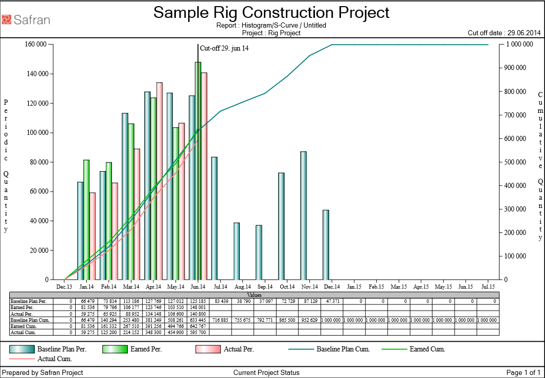
Histograms are one of the most popular ways to display project data in a report. A histogram is an accurate graphical representation of the time distribution of data – usually
The bars in the example above indicate the periodically Planned-, Earned- and Actual-value for each project month, while the lines indicate the accumulated Planned-, Earned- and Actual- value for the project overall.
Planners use the Histogram/S-Curve as part of their periodic reporting as it is a valuable way of showing Planned vs Earned vs Actual over the project lifecycle.
Manpower Histogram (Resource Capacity and Demand)
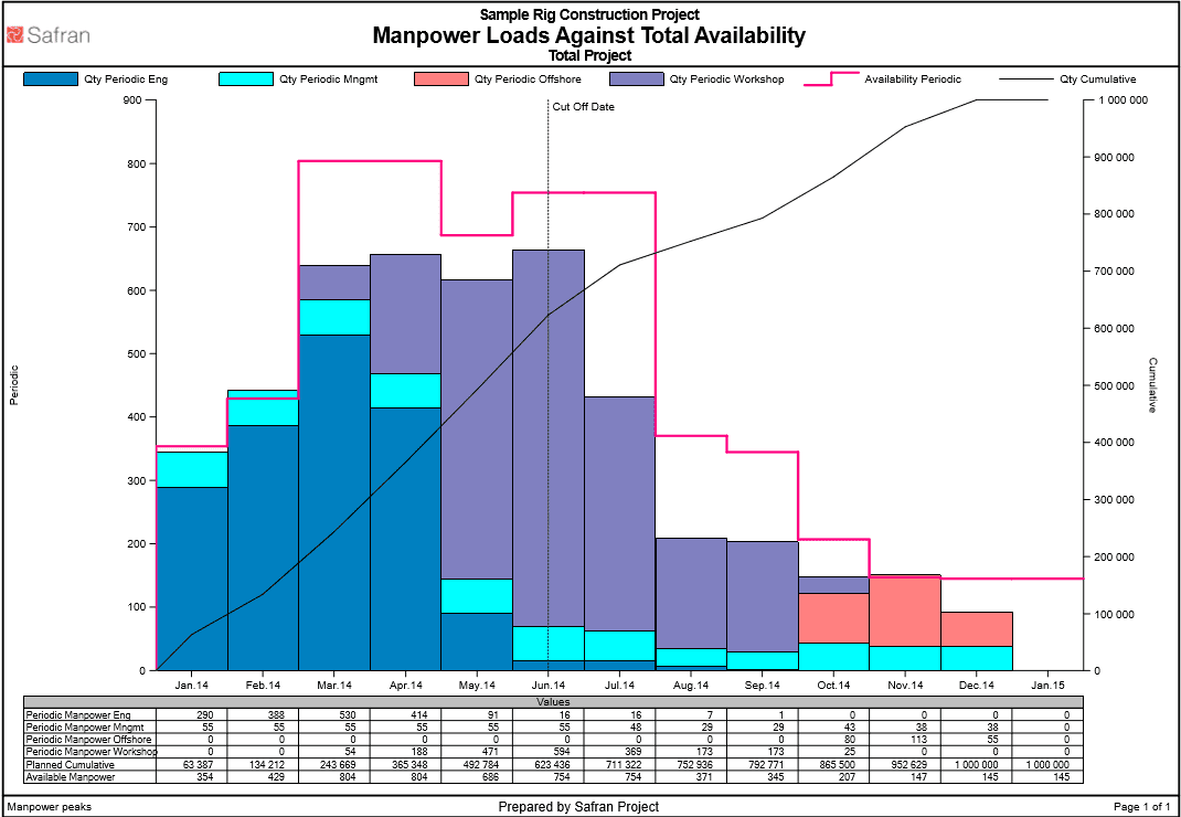
A Manpower histogram shows the number of personnel needed to perform planned work. When including an availability curve, the manpower histogram helps planners understand resource capacity against demand.
The example above shows bars stacked into the different resource types. When the planner understands the resource capacity, it's easier to avoid resource overloads which can lead to project delays.
In Safran Project, this histogram is real-time and will reflect any changes in schedule and/or planned resources as they happen.
The Power of Project Planning Reports
An understanding of these 5 project management reports is vital to communicating relevant and timely information to key stakeholders.
Project planning reports give project managers more control over their project and reduce the time spent balancing resource requirements with resources available. It also helps ensure that the necessary resources and skills are available at the right time and in the right place, enabling greater project success.
Safran Project software can help you gain visibility into project progress and status, resource conflicts, and provide an accurate forecast across your projects from initial planning through to execution.
